I wanted to periodically grab a snapshot of the mainline/default branch of every repository on my locally hosted Forgejo Git server. I wrote the script below for Node 20+. It has no external dependencies. It’s not fancy, but it works for me.
Save it as a .mjs file (or use node --input-type=module scriptname.js).
You’ll need an Access token to grant the script privileges to scan your repositories and download the primary branch.
Go to your user’s access token Settings > Applications > Access Tokens
Then, provide the token a name (it’s just for your notes).
Select repository permission: read
Select user permission: read
Add your username and token as shown in the script.
Change the GITEA_HTTP_SERVER to the name of your git server. Mine is called sourced in this example.
Repeat the process for any other users you want to add.
Then, start the script. It will download to a subdirectory called repos/{username}. Or, you can modify the script to save to another location.
js
import { writeFile, mkdir } from "node:fs/promises";import { Readable } from "node:stream";const GITEA_HTTP_SERVER = "sourced";// PUT the user name and an application token in the array of arrays:// It might look like this:// [ ["acorn", 3bd876af5a5629c31982900cd4f8956a469cccec" ]]const TOKENS = [["username", "access-token"]];async function getRepoNames(name, token) { const response = await fetch(`http://${GITEA_HTTP_SERVER}/api/v1/user/repos`, { method: "GET", headers: { Accept: "application/json", Authorization: `token ${token}`, }, }); const repos = await response.json(); return repos.map((repo) => [repo.name, repo.default_branch]);}async function downloadRepo(username, token, repoName, branchName) { const response = await fetch( `http://${GITEA_HTTP_SERVER}/api/v1/repos/${username}/${repoName}/archive/${branchName}.zip`, { method: "GET", headers: { Accept: "application/zip", Authorization: `token ${token}`, }, } ); if (response.ok) { const stream = Readable.fromWeb(response.body); await mkdir(`./repos/${username}`, { recursive: true }); await writeFile(`./repos/${username}/${repoName}.zip`, stream); } else { console.error(`Failed to download ${repoName}, ${response.statusText}`); }}for (const [name, token] of TOKENS) { const repoNames = await getRepoNames(name, token); for (const [repo, branchName] of repoNames) { await downloadRepo(name, token, repo, branchName); }}
I really appreciate you stopping by and reading my blog!
You might not know that each Epic blog post takes me several hours to
write and edit.
If you could help me by using my Amazon affiliate links, it would further encourage me to write these stories for
you (and help justify the time spent). As always, the links don't add cost
to the purchase you're making, I'll just get a little something from Amazon as a thanks.
I'll occasionally write a blog post with a recommendation and I've also
added a page dedicated to some of my more well-liked
things. While you can buy something I've recommended, you can also just jump
to
Amazon and make a purchase. Thanks again!
The first healthcare conference I attended was TEPR sometime in 1995. TEPR was of course an acronym for Toward an Electronic Patient Record. I was on the Cadence GUI Team at that time, but the sales team wanted to show Cadence and EpicCare Ambulatory to the TEPR audience. Attending the conference meant we’d have an opportunity to see what else was out there, and honestly, have a look at the competition. We’d staff the booth for some of the time by answering questions and redirecting competitors away from the booth.
While I’d been to Florida as a child (Disney World), I’d never been to the “East Coast” of the United States. The farthest east I’d been besides Florida was Ohio. The experience was definitely new for me, and while Introvert Aaron was not entirely enthused about staffing the Epic booth, seeing what others were doing seemed interesting. I can’t find the old schedule for exactly when and where the TEPR conference was held that year. Since the Medical Records Institute folded in 2009 (the organization that hosted the conference), the data may be lost to memories only.
In any case, Washington DC here I come!
The conference was two days, and I was arriving with another software developer on the Cadence GUI team. Our team leader was to show up later as he was on a sales trip and wasn’t flying directly from Madison as we were. Our schedule was to fly in the early morning and leave the next day afternoon.
As you read further, this was 1995. Cell phones were luxury items. Paper maps were all the rage. AOL was the way we got online. We had no laptops (or computers of any kind with us). We had no access to our Epic internal communication system.
After checking in, we got all dressed up and headed to the convention.
🤣
I assume many of my readers have been to the Epic campus (either as an employee or as a customer). Voyager Hall, the training facility has meeting rooms that can seat anywhere from 50-250 people depending on arrangement. They’re large, but not huge by any means. Or, if you’ve been to HIMSS and the Epic booth, I’d guesstimate the current Epic booth was about the same size as the entire conference floor.
TEPR 1995 would have fit into the Epic HIMSS booth.
Needless to say, we were not aware of that before we set foot in the exhibitor hall. This would have been Epic’s first time exhibiting at this conference so our expectations were much grander for the size of the conference and the number of attendees. There were maybe 50 exhibitors TOTAL. We walked around for about 20 minutes at a very slow pace looking at the vendor names and gathering a rough understanding of what was being exhibited. It was underwhelming. There were no educational sessions for us to attend. It was essentially the exhibitor hall.
However, what was more confusing: we couldn’t find the Epic booth!
After a tiny bit of checking: it wasn’t that we needed a map. We’d actually seen the booth several times. It was the booth that had a folding table set up with two chairs but no one there — that was Epic’s booth. The salespeople hadn’t shown up!
Surprised — we decided to call back to Epic. What’s funny is that I don’t remember how we did that. We were discouraged from using the hotel room phones as their rates back in the 1990s for a long-distance call were HIGH. Like, someone is getting rich high.
What we learned: the sales team was delayed and still planned on showing up. Our TL was on his way and would be arriving later in the evening (he was already on the plane). After relaying the poor attendance and lack of vendors, it was decided that sales team would not show up at all. We enquired briefly about alternate flights, but … remember, 1995, it wasn’t something that was easily done quickly (and we had no access to the agents).
We decided we’d make another pass through the floor, talk to whomever would listen and then wait for the TL to show up.
Honestly, that took no more than 45 minutes before it became completely obvious that spending any more time on the convention floor was pointless.
We were at a loss for what to do. It wasn’t like we could just work remotely — all we had was a pen and paper for notes.
Note: SEND HELP.
I like doing software development, but I wasn’t going to try to hand-write code! We also didn’t have any compelling designs or anything to talk about.
Hmmm. Washington D.C. may have some things to do.
We went to the front desk of the hotel and enquired about seeing the city. They had a tourist map, provided some basic instructions and said the subway was the best way to get around quickly. We had about 4 hours till our TL was to arrive.
We quickly changed and headed out. We found a subway entrance nearby and asked the super friendly agent about tickets, getting around, safety, what to see, … they were amazing! We’d explained how we had limited time, new to D.C., etc. and as it was at an odd time of the day, we were the only customers.
Off we went. We saw more of D.C. in those 4 hours than I think should have been humanly possible. It was AMAZING. For those of you keeping score: it was during a work day on Epic work hours. The SHAME! (We sincerely wanted to be working, but there was no work to do!)
We got back to the hotel very shortly before the TL arrived. After explaining the situation, he called back to Epic and we learned that changing flights was way too expensive, we’d already paid for the hotel stay …, so coming home early wasn’t an option. We had dinner at the very overpriced hotel restaurant and made plans for the next day. He’d go walk the convention floor briefly and then … we’d do a rapid tour of D.C. with him. 🤓
Our fearless TL wanted to see some of the same sights we’d visited but we also took a closer look at the United States Capital building. There were two funny events that happened there.
First, CNN was filming live about something. Our TL wanted to get in behind the shot and wave. He did. Maybe on some archive footage of CNN on a VHS tape you’d see him waving … but not me. We stayed back (we had great fear).
Secondly, we wanted to go in the Capital building. There was a long line though. It wasn’t “security” as much as it was just basic crowd control. We didn’t have time to wait in line, so we wandered around the Capital building instead disappointed by the line. There were a few doors … and one that didn’t have anyone there watching it. We walked up, checked it — OPEN! — and went in. We essentially used a “back” entrance!
I may be exaggerating, but my feet felt like we did 42 million steps after those two days and I recall how painful my feet were for several days afterward. But, the experience was worth every step, even seeing the same sights twice. I didn’t have a camera as I hadn’t expected to do any sightseeing while we were there.
What conferences have you attended that you fondly remember because of the work you didn’t do?
Overstaffed with newly hired software developers on Cadence, the small Cadence GUI team had to adjust to the economies of doing Epic business.
The Cadence development team had approximately doubled in size and simply did not have enough experienced developers to maintain a high degree of software quality. In fact, the quality had noticeably dropped. New code. New bugs. It was a runaway train … of bugs (yuck!). Of course, it wasn’t really the new developers’ fault — they were new and the code base was already quite large and very complex in many functional areas. The environment was stacked against their success unfortunately.
Using a Midwest cow 🐄 analogy as is common with Epic — the area that was fenced off for Cadence had unfortunately a massive number of cow-pies you could step in. (Cow pies = 💩 for those not in the know.)
There wasn’t much documentation to help them either. The code was … shudders … the documentation. It was a ruthless enemy of knowledge. MUMPS code can be a real chore to follow and debug, especially with the ability to extend workflows with customer driven code extensions (we called them “programming points” for many years). Cadence used these extensions a lot in some workflows.
Programming Points used in Chronicles Screen Paint added a whole new level of “whaaaa???” to projects.
An basic example of these programming points in use could be when an appointment was scheduled. When that happened, custom code, either written by Epic for a customer, or by the customer directly, would be executed. An appointment might trigger an interface message to another software system or print a label, or … Whatever was wanted! It literally was just a placeholder for “execute anything.” There are better design patterns for creating functionality like this today, but the Epic solution was functional and worked within the MUMPS environment. The often frustrating part of the programming points was understanding what their side effects might be and what expectations programming point code might have. They weren’t documented well. To be clear, the level of documentation these programming points received was often better than what other external systems and products were doing at the time (which was generally little to nothing), but we hadn’t delivered something remarkably better either. It would have great if more boundaries had been clarified for sure.
To further add complexity to these programming points, it was uncommon for Epic to have access to the code used at customers (and especially in a live/demo/testing environment).
While there were a number of starter projects for the new hires, each project required more attention for design, programmer review, and testing than they had been getting. The team had experienced developers and were generally very trusted to commit good code, so code reviews and testing were light generally. But, the new round of hires changed everything.
A choice was made in a meeting I wasn’t invited to attend. I would have needed my perfect poker face at that meeting to not express my true feelings. It’s better that I hadn’t attended as I doubt I could have maintained a “rah rah” attitude.
In this meeting, it was decided that Cadence GUI software developers would spend no more than a 8-10 hours a week on GUI and the rest was devoted to code review and testing. Ugh!!!
While I absolutely understand it was a necessary outcome as a positive Epic business decision, the impact on my personal happiness was profoundly negative. From daily new challenges of building Cadence GUI to a slog of reading MUMPS code and trying to interpret not only code that was often new to me, but trying to understand whether the code was the right choice was draining. Day after day after day.
And day after day. After day.
As has been a common Epic theme over the decades, Epic had committed a lot of functionality for sales and customers and the results was a massive backlog of development that was contractually committed for the next release cycle. While I’m sure the senior developers could have completed the work faster and with fewer issues, it would have been a terrible disservice to the new hires and our future selves. We threw them into the fire. This was a period were we had few fire extinguishers as well. Many fires needed extinguishing. We needed the new hires to learn how to prevent code fires earlier and that required us to adjust.
The days continued. This period went on for about 3-4 months before I’d reached my breaking point.
You’re probably thinking that I was impatient. Yes, about many things I’m terribly impatient (don’t ask my wife!!!). When my mind goes into boredom mode, my enthusiasm shuts down. My itch for creative outlets becomes the focus of any idle time (and often distracts me from the task at hand). Being allowed about a day a week to work on Cadence GUI was a tease in many ways. Little got done as it was difficult to start and stop something that was so fundamentally different from the quality assurance work. Context switch. Context switch. GUI! Context switch. I’m sure my hours worked went UP during this period so I could work more on the thing that was excited about (sad, but true).
I’ll be interested to hear what others think — is the ability to shift resources for short term crises like this a strength or a weakness of Epic culture? The number of times that something comes up and a human is tasked at Epic to do something else for some period is uncountable. Emergencies — sure. But, what about when the reason is poor planning?
I could draw a lot of squiggly lines on a whiteboard that would eventually connect to demonstrate why I found myself back in Carl’s office at the end of this period asking for a new team or project. It turned out — there was a need elsewhere as EpicCare Ambulatory had outgrown Visual Basic 3 and Windows capabilities, so there was work that needed to be done. They had dug themselves a large hole with their design and implementation that ran into unbreakable limits within Windows 3.11 and Windows 95.
But, that’s a story for next time.
Thanks if you’ve subscribed to my newsletter! Every subscriber helps me know that you find this content interesting. Pleasesubscribe if you haven’t already!
I really appreciate you stopping by and reading my blog!
You might not know that each Epic blog post takes me several hours to
write and edit.
If you could help me by using my Amazon affiliate links, it would further encourage me to write these stories for
you (and help justify the time spent). As always, the links don't add cost
to the purchase you're making, I'll just get a little something from Amazon as a thanks.
I'll occasionally write a blog post with a recommendation and I've also
added a page dedicated to some of my more well-liked
things. While you can buy something I've recommended, you can also just jump
to
Amazon and make a purchase. Thanks again!
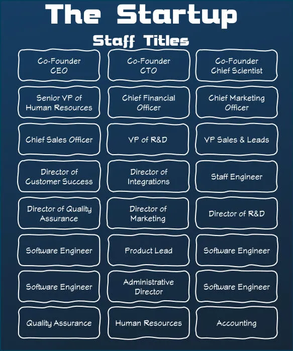
I routinely look at the “about” pages of startups and companies I’ve just learned about. A company of 5-30 people too frequently has a page of titles that are very similar to this:
In fact, I took inspiration from a few that I’d just looked at to make that graphic.
CEOs, VPs, CTOs, Senior VP of Human Resources, Chief Marketing Officer…
The list goes on and on. It’s hard to believe that anything gets done given introductions at meetings must take a half hour.
This type of culture and company isn’t the “gets stuff done” that I look for when researching companies or doing investing. The titles get in the way of a collaborative atmosphere. You can respect someone’s ideas, wisdom, knowledge, and accomplishments without needing a label or a title. If your company is bogged down in these titles, what other parts of the company are getting in the way of getting things done?
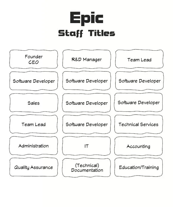
In late 1994 early 1995 at Epic, you can see below the titles that we generally had. Epic had been around for 15 years already at that point. Well beyond the startup phase. 😀
As you can see — there weren’t many. I may be forgetting one or two, but I think these capture the essence of what we had pretty well. Epic was very heavily invested in software development and it showed. Software developers made up the majority of the staff. We had no “levels” or titles for developers that had been on the staff for a decade or more. Software Developers were software developers.
Software developers, as generally defined by Epic at the time, focused on all aspects of creating software, from inspiration, design, to project completion and testing. Team leaders did not create designs and there were no architects on staff that were creating boring UML swim-lane diagrams to follow.
Epic was a small enough company that there wasn’t need for titles. We got things done. The things we created became our calling cards, not a title. An interesting side-effect of not having titles was that employees were not scratching and fighting their way for a new coveted title (definitely a story for later during my non-Epic years). Epic’s (unwritten?) policy was to provide opportunities to staff for them to experience growth in skills and responsibilities. Successful staff had more options.
The harder I worked, the more fun I had, with no new title required.
Honestly, it’s pretty easy to spot someone that talks about doing things and has a great title at a company compared to someone who builds software at a company. I understand some level of management, administration, etc., may be necessary part of doing business, but what about everyone else? Is the new hire more interested in their title or the work that they’ll be doing?
To be clear, even without titles, it wasn’t uncommon for more experienced R&D staff to concentrate on some particular aspect of software development and spend less time overall than another developer might on the same task. That’s natural and plays to an individual’s strengths and company needs. One developer might do more code review because the team had hired more staff for example (that’s likely my story for my next Epic post).
My challenge to new software startups: skip the titles and instead make a great product. Be concerned with titles another day (or maybe never?). Concentrate on the success of the people and the collaborative culture.
Thanks for reading my Epic post, but before you go… I have an email newsletter subscription with several support options now available! Please check it out and subscribe! I’ve had a lot of people tell me they enjoy the content but I’ve had so few subscribers it has been tough to be motivated to continue (and it’s a paid service to add to the demotivating factors). If you know of others who might enjoy this content, please tell them!
I’m hardly a fan of a traditional “American Apple Pie”. I’ll eat them, but I’ll look for a better dessert option before I select an apple pie (and most every pie for that matter). I like a good dessert, and if I’m going to eat a lot of calories, I’ll choose something else. In fact, my wife enjoys baking and made a Skillet Pan Apple Cake that was way better to me. But, this isn’t going to be thousands of words about some nonsense like ad farms recipe web site followed by 30 advertisements and finally the recipe. Well, there won’t be advertisements at least. 😏
On EpicCare, on Cadence, and on Tapestry!
The third Epic graphical user interface application launched was Tapestry, the Managed Care solution. The team started shortly after Cadence GUI got off the ground. As I was on the Cadence team at the time, we did quite a bit of initial code sharing—hello copy & paste—with them so that they could get going and save the step of trying to start from the far larger codebase of EpicCare ambulatory at the time. There wasn’t much code sharing at the time beyond the initial dupe and drop though.
I’ll clarify: when there was code sharing it was via copying a file (and whatever specific functionality was necessary). While every team had storage space on a shared networked drive, there absolutely was no real source control system in place. No Git. No SVN. No CVS. There were no Git forks. Some of you may be horrified. 🤯
Long Live the Mapped Drive
Just a folder on a mapped drive (for non-Windows folks, it just meant that Windows PCs had a remote drive available as a specific drive letter, like M — we had M\cadence for example. That location presented as if it were local to our workstations).
That’s all we had and all that was used. It was organized chaos 🤢 at best. We were STRONGLY discouraged from doing file searches on the network storage (as it wickedly thrashed the server drives), so if we wanted to take a sneak peak at another team’s codebase, we’d make a local copy.
I’ll loosely admit the shared folder “worked” because there were only a few of us using any given team’s source code.
Later a developer on EpicCare created a small front end to file copying and introduced the idea of a “locked” file so you could tag a file as being in use and expecting changes. Manual merges of source code were 🤬, high drama, significant pain, and unwelcome events.
Visual Basic 4 and earlier versions weren’t focused on or designed for monstrously large code bases (yet all these applications were rushing headlong into that very situation unfortunately). Further, Visual Basic wasn’t then targeting code sharing either. Sharing meant making a copy and adding a dash of luck and a pinch of hope.
If you knew that someone had snagged a copy of your code and you enhanced it or fixed an issue, the Midwest Nice thing to do was to notify them of what you’d done. Honestly, there wasn’t much of that. The code diverged quickly. Think two children, a box of crayons, and the same drawing to color. The end results may be … dissimilar.
We were young and foolish in many ways, and of course sought to improve and toss our opinionated coding styles into “our” copy of the code generally neglecting to share at all. There wasn’t time we justified (and there was absolute truth to that unfortunately).
As the code bases grew, it became clear that the lack of sharing was becoming a maintenance issue. The Cadence GUI changed the styles of editable controls. Images and icons. Database code. It was all moving along and the only real blessing at the time was that it still wasn’t common for users of one app to need to use another app. So, they wouldn’t see the differences.
We knew though. Oh we knew.
Independence did not mean the code was improving. My favorite recollection of how bad things had become is a highlight for the cultural and technical problem that we had collectively created.
The MUMPS programming language has a function that I am confident is used literally billions and billions of times every day across all Epic customers to this day. It’s fundamental to string parsing in MUMPS. It’s the spice of MUMPS that makes the universe code flow.
It works like this (in a commonly used form):
PIECE(SOURCE,DELIMITER,PIECE_NUMBER)
SOURCE (string) - Target string to be parsed for substrings based on DELIMITER
DELIMITER (string) - One or more characters to use to identify the substrings of the SOURCE string
PIECE_NUMBER (integer) - Given the SOURCE and the DELIMITER, this value represents the specific substring string based on a one-based index.
It’s extraordinarily common to reach for the piece function when storing data in MUMPS globals or even when passing data to functions or when doing RPCs to the server from the GUI application. It’s a useful way to pack data into a single value.
All the GUI applications needed a piece function to extract substrings that had been lovingly hand-crafted in MUMPS.
The Application Kitchens
Because we all knew better than our predecessors, each GUI team had their OWN piece function. You’d think something so fundamental would be shared. Mmm. No.
There was a reason other than hubris why Cadence GUI didn’t share the piece implementation that was used by EpicCare at the time. At first we shared like cousins once removed (“here — take this, I’ll see you at the next reunion!”). However, during a dark day of debugging an issue of code that seemed like it should be working from reading gobs of application code, I debugged into the piece function, baffled by what was happening. Step. Step. St…
WHAT THE FUNC IS HAPPENING???
The EpicCare piece function that we’d been using included a bug. When requesting the last substring from a string in several cases, it would improperly add a empty space character! Like finding a bug in an apple pie, it was just as unwanted in this code.
I rewrote the piece function to exclude the functionality of adding an extra space and tweaked some of the logic so that it would do fewer string concatenation operations leading to a measurable performance boost (the old 386SX/486 Intel chips along with the slow RAM of the day weren’t great at hiding mindless copies that I see far too frequently today in code).
Yes, I did make a journey over to the EpicCare team to discuss the discovery. They were interested and investigated, but … postponed a fix their version indefinitely. They had built a unfortunately surprising amount of logic that depended on the bug so fixing the issue would be far more impactful than desired. They stuck to their recipes.
By postponing the fix, they of course made the impact larger over time. They may have decided to include the new bug-free and faster version as a Piece2 — I can’t remember for sure. Eventually, they fixed their function once tracking down all the locations dependent on the incorrect functionality. To be clear, the piece bug didn’t cause a bug in the application, as their code expected the bug. There was no end-user impact.
Tapestry learned of the bug and rather than using the version we’d created and tested on Cadence GUI, … they wrote their own. I don’t know why. I imagine a developer thought they could further improve the performance of the piece function for some edge cases.
I am skeptical that the amount of extra time spent to attempt further optimizations was realized as a benefit to end users especially given the cost of and loss of time to make and test the changes (and run comparisons, etc.).
In case you’d forgotten, Visual Basic did not have a unit-test or profiling infrastructure at all. If you wanted “test code”, you’d add it, and then remove it (or comment it out if it could be valuable in the future). There were many developers that used their watch or a stopwatch to do performance analysis back then. It was elementary at best.
I wish I could honestly say I’ve never spent time over-optimizing a function. Those who know me well also know that I later practiced and evangelized:
“optimize when you need to optimize and no earlier.” -A More Mature Me.
Or …
“Sometimes you’ve got to know when to hold back optimizations, and other times, know when to fold them in.” - Definitely NOT Kenny Rogers
The amount of duplicated yet diverging code grew until their was an upswell of interest in creating a new team to maintain and share application code. After a few meetings, it was a go. Not long after, the team was staffed by one developer full-time with assistance from all the GUI application teams.
It was called…
ApplCore
One of the primary motives of the ApplCore team was to release shared code with the applications which was a different strategy from the “Core” Foundations team. (Get it? Application Core vs Core? Yeah, not original.) ApplCore wasn’t a product as much as it was a “concept.”
The Foundations team was always working on a version ahead of products. Changes in Foundations would be made, tested, and then released on a specific date. Teams would then take that release, do their development during their development cycle, and ship a release.
The rationale was that the Foundations team wanted maximal “baking” time for their code. By releasing a full development cycle ahead, they could be generally assured that their code would be tested at Epic for a full application product development cycle.
But ApplCore would be different. The delay of doing coding a full release cycle ahead didn’t work well for application products. Requiring a massive amount of predictive coding was untenable: “what are we going to need in 18 months”?
Unlike Foundations, the ApplCore code still lived in its own source tree. There was no obligation to take the code at any particular time, but teams were expected to not make changes to a copy of the ApplCore code without contributing back to the original.
I’m going to save the details of why ApplCore was doomed to fail for a later post. Some of you may know. 😉
And now onto the tasty part …
Apple Pie Skillet Cake, Canned Apple Pie Filling version
This is not low calorie, healthy or low fat. This is tasty and straightforward. It’s not fancy. It uses canned apple pie filling. 😋
1 10-inch iron skillet
1 20oz can of apple pie filling (sweetened)
1 cup unsalted butter (2 sticks)
1 1/2 cups packed light brown sugar
1/2 tsp. ground cinnamon, plus a little more for topping
1 tsp. pure vanilla extract
2 large eggs
2 cups all-purpose flour
1 tsp. baking powder
1 tsp. kosher salt
Optional, but say YES to vanilla ice cream (or a cinnamon ice cream is also GREAT)
Preheat Oven to 350F
(Optionally stir in 1 tsp of cinnamon into the apples in a bowl)
Melt 1 cup butter in a microwave safe bowl (or on stove)
In large bowl, whisk in the vanilla, sugar, and 1/2 tsp. cinnamon
Once well combined, whisk in eggs until smooth
Add flour, baking powder and salt until just combined — don’t over-mix
Fold approximate 1 1/2 of the can of apple pie filling into the bowl
Pour batter into skillet
Bake for about 25-30 minutes (check with a toothpick — should come out clean)
The pan will be HOT 🔥 (and stay hot)
Top with remaining apples and add extra cinnamon if desired
I really appreciate you stopping by and reading my blog!
You might not know that each Epic blog post takes me several hours to
write and edit.
If you could help me by using my Amazon affiliate links, it would further encourage me to write these stories for
you (and help justify the time spent). As always, the links don't add cost
to the purchase you're making, I'll just get a little something from Amazon as a thanks.
I'll occasionally write a blog post with a recommendation and I've also
added a page dedicated to some of my more well-liked
things. While you can buy something I've recommended, you can also just jump
to
Amazon and make a purchase. Thanks again!