You won't believe what color they selected ...!
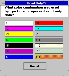
Of the numbered choices below, which color combination was used as the “read-only” data entry field in EpicCare Ambulatory/Legacy?

The background color of most of the UI was “battleship gray” as shown above.
You may remember from my post The App is Too Fast!, that Visual Basic 3 (and Windows 3.11) had a very limited color palette. Even as I created that sample application in Visual Basic 3 for this post, I was again surprised how few colors we had to choose from!
In any case, I’m waiting for your answer.
Come on. Stop trying to skim ahead to see the answer before you pick.
It’s definitely not #14. As the background color is a dithered orange, there wasn’t a reasonable color combination that worked well for showing text on it correctly (as you can see from the screen shot).

There were very few (if any) design guidelines for how a graphical user interface should LOOK back then.
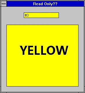
OK, alright. It was #3. A yellow background and black text.

I never heard a concrete and well-reasoned explanation for the choice of yellow. What this meant was that if there were fields/inputs on a form that were not currently available due to configuration or selections made by the user, instead of a typical white background, the input background would be yellow.
On a screen like EpicCare Ambulatory Order Entry back then, where 95% of all the fields that might be used by any combination of an order (labs, prescriptions, tests) were placed, many of the fields would be shown as yellow at any given time.
“White means work.” —Nurse from Kaiser Permanente NW
During a few day site visit to Kaiser Permanente NW (many years before the big sale to Kaiser Permanente National), I and a few other developers were following a nurse around during her shift. She had just walked up to a shared terminal and started to place an order. That’s when she said that.
“White means work.”
What was interesting about that was that she had just landed on one of the most complex screens in all of EpicCare Ambulatory at the time. It was a chaotic orchestration of labels and inputs and list boxes, and tables and … literally everything seemed like it was on this form. Imagine the drawer we all seem to have, the one with every miscellaneous thing in it to handle nearly anything that life throws at us.
That drawer was Order Entry back then. If you could find it all, you could finish the task.
As she moved through the necessary selections of the particular order she was placing, the seemingly endless fields on the screen changed to “white” and that’s when she uttered that amazingly memorable phrase.
She was disappointed by how much of the screen was going to require active input and energy from her. When we asked for specifics, she mentioned how the “old way” was faster because there was far less tedious fill-in-the-blank to make the computer happy.
Her complaint wasn’t about the yellow — it was about the fact that this modern system frustrated her and signaled that she’d need to do extra work to satisfy the computer.
Is the work that the customer is doing for your software or for them?
Think about that as you create your next app or workflow. Please.
The Yellow Rectangle Road …
During our initial Cadence GUI design sessions, we avoided the “yellow” backgrounds for read-only fields. While it was a departure from the established style of EpicCare, the users of these applications would have zero cross-over at that time. We picked #10. There was some internal moaning, but we held fast.
“Hold the grays!”
I know there were limited color choices, but for me and the way I’m wired, bright yellow rectangles drew my attention unnecessarily when these should have been no more prominent than the white text input fields. In fact, I see them first as I suspect is the case with many others.
The yellow background remained part of EpicCare for more than a few years. Thankfully, it didn’t continue through the EpicDesktop/Hyperspace transition.
What color would you have picked (given the choices above)?
