If you buy something from a link, Acorn Talk may earn a commission. See my Affiliate Programs statement.
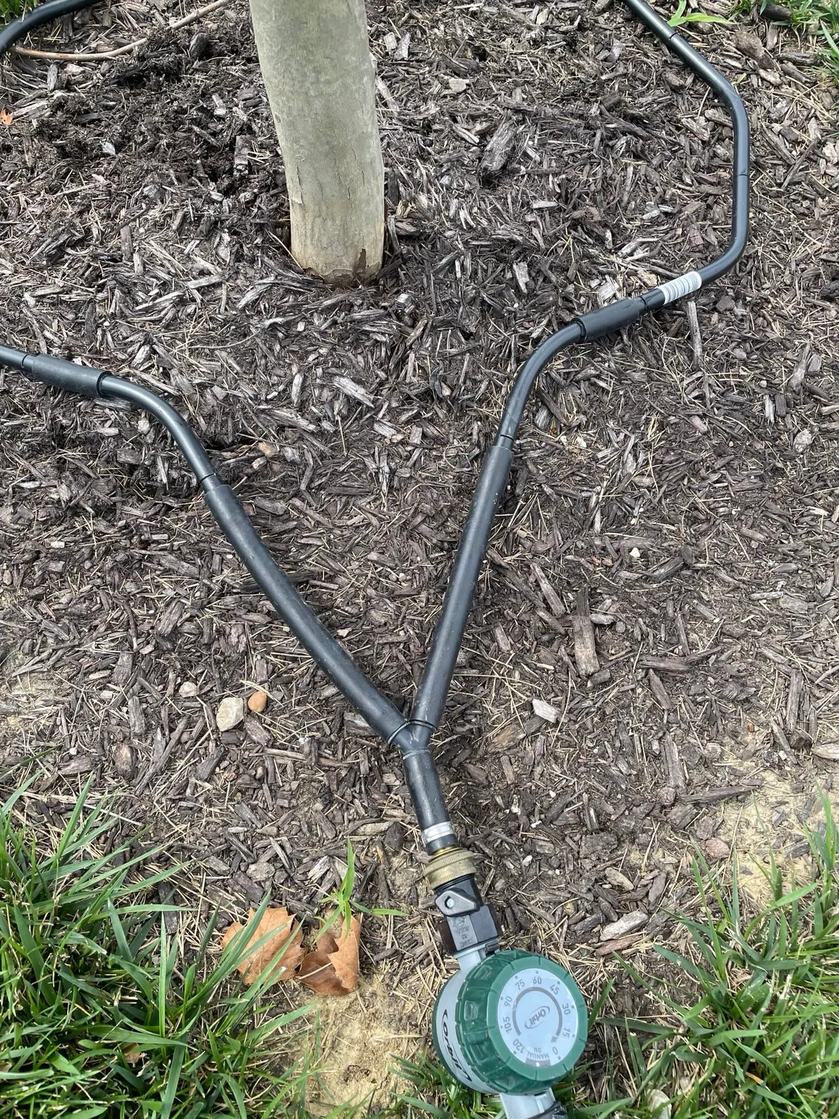
This is embarrassing. We’ve been using a combination of a few simple devices as a very reliable way to water some trees we planted last summer, and today I decided I’d provide a few details about the products. But, when I went to Amazon to grab a link for the primary part of the solution, it’s no longer for sale! On it’s own, that’s not too surprising as resellers come and go seemingly every hour on Amazon. This one however is because the small company (person) making them has retired and has stopped making them. 😒
Over the years, we’ve tried a lot of different ways to water new trees and bushes. So many failed miserably. From those large and small tree watering bags (thanks for the leaks!) to just the plain hose end. The key to watering trees is generally go slow — so that water can saturate the roots.
The breakthrough for us in convenience and reliability was the discovery (and subsequent purchase) of this: Waterhoop.
It’s not complex, but that’s what has worked so well for us. Once connected to a common hose and the spigot is turned on, you control the water volume directly on the hoop (so no walking back and forth to the spigot to get it “just right”). Water drains or sprays (depending on volume) through a series of small holes around the hoop ends. And, that’s it. As it’s flexible, it adjusts to a variety of situations. Having local control is brilliant — it’s such a simple feature that saves time!
As we live in a suburban neighborhood now, the water pressure changes during the day. Before we had this combination, we’d set up a hose at the base of a newly planted tree, set a timer for an hour, get the flow just right … and return an hour later to find that the water was just dribbling out, nothing like we’d originally set it. Now, with the simple flow adjuster at the end, we can be assured that the water amount we want will be the amount an hour later (as we turn the flow up at the spigot far beyond what we actually need as it’s now regulated near the target rather than the source).
While setting a timer on a phone, smartwatch, etc., works, it’s been even more useful to put a mechanical timer at the end of the hose, again right near the target. So, we can set it for 60 minutes, and not be concerned that we’ll over-water if we forget to go immediately out when a timer signals. We’ve had digital timers on the source end, and frankly, they’re more than we needed for this, and not needing a battery has been great too!
The Orbit Mechanical Watering Hose Timer has performed flawlessly for us. By moving it to the end of the hose, we can quickly set the timer, adjust flow as needed (with the flow adjustment on the Waterhoop), and be done with it.
While these things may seem unnecessary (and truly are), they’ve been a big time saver for us as we were watering weekly, and more importantly, we were able to control the amount of water far more precisely than before.
Overall, I’d totally recommend both of these if you’re watering trees, bushes, etc.
OK, but I know — the Waterhoop isn’t available anymore. I’d picked the Waterhoop because of the very good reviews and the fact that it was made in the USA. Instead, if I couldn’t make one myself (I’d try!), I’d switch to using a soaker hose for trees with a few tweaks. I’d either get rid of the “Y” part or make it a quick connect on one end with a product like the Eden Quick Connect. That way, it would be a snap to remove it from one tree and move it to another. If I wasn’t concerned about a “true” loop, then I’d use a hose end cap. I usually have a few of those around. It’s possible that the drip of these would be slower than I’d need for our soil, so I’d carefully make a series of very small punctures around the hose to increase the drip speed. It probably wouldn’t matter much, but rather than having two potentially fiddly valves on the “Y” adapter, I’d add an independent coupler with flow control.
I really appreciate you stopping by and reading my blog!
You might not know that each Epic blog post takes me several hours to
write and edit.
If you could help me by using my Amazon affiliate links, it would further encourage me to write these stories for
you (and help justify the time spent). As always, the links don't add cost
to the purchase you're making, I'll just get a little something from Amazon as a thanks.
I'll occasionally write a blog post with a recommendation and I've also
added a page dedicated to some of my more well-liked
things. While you can buy something I've recommended, you can also just jump
to
Amazon and make a purchase. Thanks again!
When Cadence GUI entered the Epic stage, the team was provided with a complete copy of Legacy/EpicCare to do with as we saw fit. There was zero process in place for any formal code sharing at the time, so we stripped our copy down to the bare bones leaving only a small communication engine and a developer hub Visual Basic Form (that I plan on talking about later).
Options for input and output with a socket from the MUMPS server were very limited back when EpicCare was started. While there were built-in functions for communicating to external devices, they were focused on brief communications and had very limited control options. Acting as a “server” for a long running persistent communication channel was far more challenging. Further, the support across vendors for options wasn’t consistent.
Faced with this communication challenge, the Legacy team built a resourceful alternative. All MUMPS server hosts supported connections via a (now thankfully waning) protocol called Telnet. The Telnet protocol shows its age these days and isn’t commonly used (and was phased out at Epic decades ago). But in 1992, it was a common service that was available on all operating system platforms Epic and customers were using.
As a brief aside, as the Telnet protocol was an operating system service, each OS (and version!) had its fair share of quirks. It was fortunately uncommon, but we would encounter situations where a version of an OS, for example HP/UX, would improperly handle a documented Telnet command. Of course, as bugs often go, it was only in certain circumstances and combinations which made troubleshooting cumbersome.
MUMPS_Command was Born
The Legacy team exposed the functionality in Visual Basic by creating a function called MUMPS_Command. When the Visual Basic application launched, using a configuration file that was dubiously secured, tied with an application hard-coded decoding key, the host application would make a Telnet connection to the MUMPS server host OS.
It would then send … locally stored credentials … (sigh, yes, that’s how it worked back then). Upon a successful login and some scripting magic in the OS, a MUMPS job (process) was started immediately and began to execute a specific MUMPS routine. This was a “captive” session.
If someone knew the user name and password for this special MUMPS_Command user, they’d be launched directly into the Epic created protocol for communication from client to server.
Some of you may have used a Telnet client to connect to a OS service for troubleshooting.
BASH
> TELNET localhost 5555GET / HTTP/1.0
It definitely doesn’t put the “fun” back in functional though.
After a brief exchange of a control sequence to verify the connection and some important settings, MUMPS_Command was ready for duty. Although “doody”(💩) may be more appropriate for the early versions.
How did it work?
I cannot say that the early versions of MUMPS_Command were robust, or secure, or reliable. They weren’t. Telnet isn’t secure. The protocol and services are terrible and have no baked-in security. And yet at the time, Telnet was used most often for connecting to a remote host. Using Telnet back in the mid 1990s wasn’t unusual, so Epic using the protocol as a connection didn’t raise any general concern across customers. (Live encryption of this data on the wire would have been unheard of back then given it was running on a secured Intranet and the massive increase in computing power required made it a non-starter).
The core idea was that a captive MUMPS job/process was either running MUMPS code or waiting for input from the end user via a terminal or pseudo-terminal (teletype TTY or pseudo-teletype PTY). Given that the Visual Basic client (Cadence and EpicCare) were remote connections to this captive process, the MUMPS code was in an infinite loop.
MUMPS
COMM NEW input,done,TIMEOUT SET TIMEOUT=300WAIT ; READ input:TIMEOUT GOTO WAIT
It’s a slight oversimplification of what the code looked like, but it’s not far off. It’s not done yet. (I also used non-abbreviated MUMPS instruction names).
The Visual Basic client, over the Telnet protocol would “send” a request to the captive MUMPS session by “typing” it and sending a carriage return (0x0D). The connected MUMPS job would receive the text and store it in the variable input as shown above. Using the syntax as shown above, the MUMPS READ command only ends when it receives a line of input (ended by a ‘terminator’ character which included the carriage return).
Now that the input has the request sent from the Visual Basic application, what’s next? The team decided on what became an unfortunate choice a number of years later. It was effective and easy. But it was fragile. And it offered no reasonable security (especially in the early versions).
MUMPS has a wonderful command/instruction called Xecute (think of it as eXecute). The string provided to this command can be any valid MUMPS expression is immediately executed. Many interpreted languages have a similar feature. JavaScript has eval for example. eval has been used many times over the years for perfectly fine JavaScript browser code, humorous hacks, and too many noteworthy nefarious reasons.
Remember, this Xecute command allows execution of any valid expression.
Some of you may be shuddering already. Good!
MUMPS
COMM NEW input,done,TIMEOUT SET TIMEOUT=300WAIT ; READ input:TIMEOUT IF input="**END**" GOTO EXIT XECUTE input GOTO WAITEXIT ; WRITE !,"**ENDED**"
(It’s weird for me to type out the full command XECUTE, as I don’t know that in my 25 years of Epic I ever used anything but the abbreviated X!)
The loop reads the input, checks to see if the client connection wants to end the connection, and if not, executes the expression that was passed.
As requests need a response, the expression sent needed to store the result in the variable X.
MUMPS
S X=$$getFut^SCHED1(" 20240705",53711)
The Xecute command parsed the expression and executed it. In the case above, the code is calling into a second MUMPS routine to get future appointments for a specific patient identifier from a specific date.
Upon evaluating the expression, the MUMPS_CommandWAIT loop would write to the Telnet session whatever value was stored in the variable X.
MUMPS
COMM NEW input,done,TIMEOUT SET TIMEOUT=300WAIT ; READ input:TIMEOUT IF input="**END**" GOTO EXIT XECUTE input W X ; sent back to client GOTO WAITEXIT ; WRITE !,"**ENDED**"
Annoyances
MUMPS for much of its existence has had extremely short string storage/length limits in memory and when stored in MUMPS Globals. Because of this limitation, and because of how the Epic invented protocol worked at the time, it meant that the Visual Basic developer had to make certain that the MUMPS_Command requests did not exceed the string limit (this number was passed to the client as part of the initial handshake).
Long requests and responses had to be broken into segments. It was very common to need to send a “request # of N” as part of a series of MUMPS_Command calls. A free text field on the client that was longer than allowed by MUMPS required that the developer break the string into pieces (pun intended) and send them in chunks. Reverse that for the server sending that same field to the client. Learning to return a “is there more work to do” was a common pattern on client and server.
Line terminator characters had be carefully transformed before being sent over Telnet to the server. If an errant 0x0D (carriage return) was in the data, it would cause the XECUTE to begin evaluation of the expression immediately. Then … the whole communication channel was broken as the client and the server protocol would be mismatched — the protocol was a simple state machine on both ends. Either waiting or receiving. There was no way for an out of band communication to be handled properly.
Line feeds and carriage returns were transformed (or $TRanslated in MUMPS) to non-line-terminating characters 0x01 and 0x02. Occasionally, those would be the source of weird Telnet service issues over the years. 😒
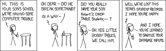
Little Bobby Tables
If you’ve done any database development in the last decade, you’ve likely seen this:
Well, MUMPS_Command had a problem that was an extension of the XECUTE command. The XECUTE command evaluated and executed all valid code.
If the client sent an unsanitized string, like a patient name with a value of: JORDAN, MICHAEL ") K ^ER S %1=(""
This would get sent to the server:
MUMPS
S X=setName^DEMOG("JORDAN, MICHAEL") K ^GLOBAL S %1=("")
Rather than the intended:
MUMPS
S X=setName^DEMOG("JORDAN, MICHAEL")
Needless to say, there was some non-Midwest nice words used in the offices for a few days as developers scrambled to fix the issue.
It really wasn’t ideal that a user of a client application could say, delete an entire global structure: K ^GLOBAL. That’s syntax in MUMPS for deleting an entire GLOBAL (KILL ^GLOBAL). This would be similar to a SQL statement where an entire table is dropped (and a huge disaster).
I’m not aware of any customer related security issue to this design. The lack of properly handling quotes caused application stability issues most noticeably.
There became a little “quote” coding challenge to verify that there wasn’t unexpected quotes and that all Xecutes worked with expressions that had been sanitized properly.
Licensing
Epic was more frugal in the 1990s than it has been in decades. When the company needed to spend money, it did, but reluctantly, and not without putting up a licensing fee fight. For many years, Epic relied on a third party vendor for providing a Visual Basic compatible Telnet client (weird weird since Epic has so often been considered a “We Build It Here” software factory).
While I believe there were two vendors that had been used, the most used vendor was from a company called Distinct. The product was called … Distinct Telnet. (HOLY MIDWEST COWS READER! Distinct exists and still sells an ActiveX version via what seems to be their FrontPage 98 web front end using ASP web pages). Frankly, it made little financial sense for Epic to write that code. Visual Basic wasn’t fast enough yet to make it viable (as it wasn’t compiled to native machine code in early versions), and there was no one with experience in creating a Visual Basic 2/3 component using C/C++ for a communication protocol, and with Telnet.
Eventually Epic reached a licensing deal with the authors of the Telnet component that seemed high at the time. The real nuisance was that it was a per-install license for customers and Epic internal use rather than a site-license. Epic software wasn’t licensed “per-machine” so tracking client devices was unnatural.
Hello Epic Telnet!
Years later, when I was the team lead of Foundations, we embarked on creating our own Telnet implementation as the costs of the Distinct Telnet component had risen and it was difficult to justify the cost to all customers — and more importantly it wasn’t as fast as we thought it should be. During the course of a few months, a talented developer created “Epic Telnet” and we tested it internally (albeit slowly and with a significant amount of internal trepidation); after a significant amount of internal testing we began to cautiously install and use it at new customers. While my team and my own feelings were more optimistic and pragmatic, I know that others felt this new Epic Telnet was far too risky to implement and far too outside of the norm for us to be developing. While I understood their apprehensive and cautious response, the deployments went well and we demonstrated how the new communication system was more reliable and faster than it had been using just Distinct Telnet (in part, not due to a fault in Distinct Telnet, but more being able to tune our code to our exact needs). The addition of Epic Telnet removed a cost and several pain-points related to the older component. Strangely, I know it took YEARS for the older Telnet functionality to be fully removed and not used. It was a slow process, not entirely atypical for healthcare IT I suppose across the spectrum of customers and cultures.
A Positive Connection
A huge amount of work was performed over the years without issue with this simple protocol created at Epic. Sometimes simple to start is all that is needed, and for Epic, it was a great early fit. It had growing pains over the years though.
We did some other cool things over the years with this Telnet based communication system, but this post has gone long …, so for another time!
In the mid-1990s, using the name “MUMPS” was becoming less tolerated by potential customers and the ISO standard had approved using M as an alternative. For reasons that are still amusing to me, Carl “strongly requested” that all uses of MUMPS_Command be renamed to M_Command. While customers weren’t encountering the name (unless they were browsing the source code, or doing their own custom development), dropping the name meant it was less commonly spoken and less used during every-day conversation at Epic. M was the new better name, for reasons. It later became RPC_Command fully dropping the M in favor of Remote Procedure Calls as that sounded more inline with terminology and techniques that were gaining favor at the time (mid-late 1990s).
I’m going to stick with MUMPS for a while longer though, unless Carl pays me to stop. 🤓
I really appreciate you stopping by and reading my blog!
You might not know that each Epic blog post takes me several hours to
write and edit.
If you could help me by using my Amazon affiliate links, it would further encourage me to write these stories for
you (and help justify the time spent). As always, the links don't add cost
to the purchase you're making, I'll just get a little something from Amazon as a thanks.
I'll occasionally write a blog post with a recommendation and I've also
added a page dedicated to some of my more well-liked
things. While you can buy something I've recommended, you can also just jump
to
Amazon and make a purchase. Thanks again!
We’d just finished a review session of the latest development of Cadence GUI with Judy. The feedback was generally positive except for one thing:
When switching between future and past appointments: “Slow that down somehow to make it more obvious what’s happening.”
We’d just spent a month adding more features to the new graphical user interface for Cadence, Epic’s outpatient patient scheduling application. One of the goals we’d set for the project was that a workflow would be as fast as the existing terminal application. Sincerely, that was a lofty goal in many ways, especially as we were in very uncharted territory and also wanted to add a number of often requested features to common workflows.
Of course, the existing terminal-based application experience couldn’t be modified to make Cadence GUI work (especially workflows or speed). There were a lot of developer hours put into to how to maintain these two distinct applications that needed to share a common code. If you’ve ever worked on a terminal/console application that has input and output, it may not surprise you that these types of operations are …, frankly, everywhere. No architectural dig was necessary to find that IO code was spread around the code as we began to adapt code and was so frustrating. It wasn’t a bug either — it was just the way code was written then. Sometimes we’d find them early in development and sometimes the elusive buggers would be uncovered in a QA pass (obscure configurations often aided in their discovery). It would have been an unnecessary abstraction to build an application in the late 1980s that could have IO that was directed at anything but a terminal. The application performance would have suffered for zero gain for the user experience. MUMPS code needed to be tight and efficient.
I’m planning a blog post specifically about some of the challenges we faced regarding this type of work and the communication channel, so, I’ll skip ahead for now.
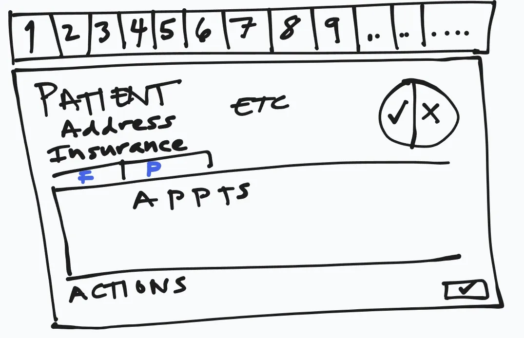
One of the first screens we wanted to show was a patient summary view. The screen would show a summary of the patient demographics, DNK appointment statistics and upcoming appointments. It would serve as a “patient dashboard” and launching point to other application functionality. This experience was not similar to the one that the EpicCare team had been building. While we shared some general UI patterns (big row of buttons floating at the top of the screen), they’d made some choices that wouldn’t work well for a Cadence user (unsurprisingly, EpicCare Ambulatory needed to make quite a few design and architectural changes years later to accommodate improved workflows and capabilities). Specifically in this case (and in contrast to EpicCare at the time), a Cadence scheduler might need to open more than one patient at a time.
The app workflow to patient selection and launching the review screen was snappy. In a head-down side by side comparison, the terminal UI was faster, but it wasn’t offering as much utility. The additional features were ones that were requested, but not available directly and consistently in the terminal app. We were happy with the results.
While obviously nervous about the demonstration to Judy we were reasonably confident that it would show well.
And it did go well, except for feedback about switching between future and past appointments.
It wasn’t a lot of data and the request to fetch past appointments was quick. When the Cadence scheduler would click on the “past” appointments tab/label, the new list would pop in what seemed like instantly (for back then — it was 1994, so the common experience was that things would be a bit sluggish).
“Can you slow that down?” — Judy
The team lead wisely, after a few rounds of “huh?”, said we’d look into some options.
If you weren’t doing application development for Windows 3.11, you may have already “solved” the problem we had with many modern solutions.
Animation
Colors or Opacity
Fonts
Layout changes
Windows 3.11 Development Issues
Here’s what wasn’t available to us:
We had 16 colors available generally, or a dithered 256. Opacity was either 100% or 0%.
There was no animation framework (and frankly at the FPS of a common computer back then, it would have been annoying)
We were limited to the fonts installed on the OS — and those weren’t many. The standard font used in VB at the time was MS Sans. It was perfectly ordinary. Sometimes we used bold. Other times, not. Purely using it as an indicator wasn’t great.
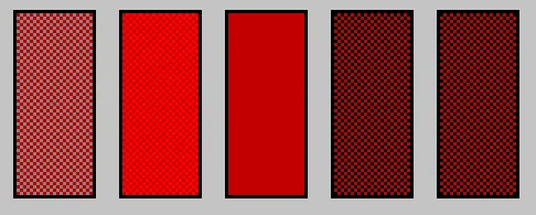
The Limitless Color Palette
Let me zoom that for you. It may not be obvious yet though …
That may have not been enough, so one last time:
As you can see, all but the middle red color are dithered. While we did use dithered colors occasionally, we did try to avoid situations where they were used with text on top as it was too hard to read. Dithered colors looked … odd … generally.
We essentially had 16 pre-chosen by Microsoft solid colors to use where we could be assured they’d look OK to most folks.
Animation
Visual Basic 3.0 was a single threaded application. If the application was animating, it wasn’t doing other things for the user. There wasn’t a graphic processor that was able to offload animations … there just wasn’t a good way to do animations that were effective.
Solutioning…
We tried quite a few different things before the next demonstration with Judy. At the time, there was a silly way to animate a GIF file — but it was all on the main application thread. For a brief period, we had a a build of Cadence that would show a silly little dancing bear that would pop-up and dance when switching between future and past appointments.
Needless to say, that wasn’t an option. I recall us floating the idea to her (with something other than a bear!). But, we didn’t like it either because while it was animating, the application was blocked. That wasn’t a great way to make the application “as fast” as Cadence text/terminal.
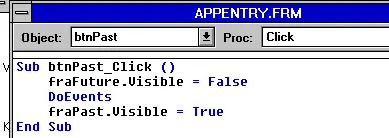
Solved with this one Hack
Oh, my head hurts that this was the primary solution that we used for quite a while to satisfy the issue:
vb
Sub btnPast_Click() fraFuture.visible = True DoEvents fraPast.visible = FalseEnd Sub
DoEvents. A necessary evil in many Visual Basic applications over the decades. When something didn’t quite work as expected, developers would often turn to DoEvents as a solution without fully appreciating that there were grave risks to its use. The core functionality of DoEvents was to allow the application to process events/messages in the message queue for the application. The events were in order, but unless the developer had planned for them, it could lead to disastrous results.
Internally, hiding the fraFuture by using the visible property would pop a WM_PAINT message onto the message queue for the application (along with the dirty region). When application code wasn’t running, Windows would process the queue (to empty), including WM_PAINTs (which were in the queue, but combined to prevent cascading updates). As I mentioned, this is a single threaded application, and processing the queue only happens when there isn’t Visual Basic code executing (VB handled this automatically).
When using DoEvents though, it would force the queue to be processed. So, the screen would update immediately (along generally with anything else that may have been queued).
So, what we’d done: introduce a flicker.
Hide
Repaint
Show
Repaint (which happened naturally by showing the new frame)
DoEvents was the source of a number of issues over the years as it “solved” problems — and created dozens of new problems.
Developers frequently neglected to handle situations where the user had interacted with the application during a busy state, DoEvents would allow those queued requests (like typing, or clicking a mouse) to process — and happen immediately, even though the normally sequential code hadn’t returned.
vb
Sub btnPast_Click() fraFuture.visible = True DoEvents ☠️ fraPast.visible = FalseEnd Sub
☠️ DoEvents: Process the queue including user originated events. Had the user clicked on a button that closed the form they were using? What if something else made the fraFuture Invisible? Or maybe they clicked back on the other tab while it was busy or … INSTABILITY!!
Happy
She was happy with the result. We weren’t, but moved forward regardless. There was lots more to do.
DNK
Do you know that acronym? It was an important statistic for schedulers.
If you buy something from a link, Acorn Talk may earn a commission. See my Affiliate Programs statement.
By the end of October 1994, we had a rudimentary demonstration of a outpatient
scheduling application written for Windows. It was no more than 1% of
Cadence functionality and little to none of the code we’d written
survived to become part of the final application. How did we get there?
Great question!
My green tea has steeped at 160F/71C for 270 seconds, it’s time to write.
At the beginning of October, I transferred to Cadence full time as a software developer. Cadence is Epic’s outpatient appointment scheduling system. If you’ve made an appointment with a healthcare organization using Epic, there’s a reasonably decent chance that Cadence was used for your appointment.
To debunk a tiny piece of recurring fake news: Epic does do comprehensive data integrations and has for 30+ years including integrating with scheduling systems that aren’t written by Epic.
I joined an existing Cadence developer that had been at Epic about a year longer than I. A few things had to happen before we began doing any real coding though. First, we excitedly installed our fresh copies of Microsoft Visual Basic 3.0. (Ok, I was excited, I don’t know that he was as much as I). For all the terrible jokes and complaints that have been made over the years about Visual Basic, especially earlier editions, the jokes were often based on opinion rather than fact. Building small utilities and applications with VB 3.0 to 6.0 was always remarkably easy. You could do circles around the common competition at the time: C and native Windows APIs. The true challenge was that it had few rules and had few if any programming guidelines. So, everything goes (and lots of things went wild).
Training?
After tinkering around with Visual Basic for a day or so, we were able to align our schedules with something that happened very infrequently — a few customers were going to be at Epic to learn how to enhance EpicCare and to code in Visual Basic. We were asked to attend so that we could gain some insight into how to program into Visual Basic and how EpicCare was constructed. The training took place in the old Rosewood conference room over a few days. There were two customers and two of us, and a few different EpicCare staff did the training.
Upon training completion, we provided some honest feedback and a few days later, the other developer and I both found ourselves in Carl’s office. Ugh.
He scolded us for our critical and honest feedback. I’m not going to sugar coat the feedback we gave: the training was poor. Not only did the developers not communicate well to the customers, they failed routinely to explain things in a coherent way that any of us could understand. I know these Epic developers didn’t do training frequently (or even have much customer interaction), but it was a substandard event. The only thing that was clear to us was that the two EpicCare developers had limited knowledge about how Visual Basic worked or why they’d made the architecture decisions they’d made. It was a slapped together system that had definitely prioritized product over medium to long-term architecture choices. It wasn’t a sustainable design.
We were instructed by Carl to take the EpicCare code and use it. That choice hurt. He’d also established a “demo” deadline with our TL.
This feedback sucked. The irony of the feedback, like our feedback had been, was that it wasn’t meaningfully actionable. My best summary is: “be more Midwest Nice.” Certainly, providing constructive and critical feedback is preferred whenever possible. But, the training was so broken that there was no way to just “fix a few things.” It’s also difficult to provide effective criticism when you can’t leverage other more positive similar training experiences. (The training I’d taken for other Epic systems and APIs had been very good up to this point, but that wasn’t a particularly valuable comparison).
We got to work in spite of this morale setback. After we had some time to review their code more away from the EpicCare developers, we found further evidence that the code was based on more than a handful of misconceptions of how Visual Basic 3 code could be structured and used. In hindsight, it is obvious to me that the team had nearly zero awareness of how Windows actually worked and how Visual Basic worked on top of Windows.
By no means would I have claimed to be an expert in Windows software development at the time.
Back in the Windows for Workgroups 3.11 days, there wasn’t as much documentation available for “Windows Internals.” Even so, there were some decent books available for Windows programmers in C. Specifically, Programming Windows by Charles Petzold are classics and have been read by hundreds of thousands of Windows programmers and date back to 1988. The great things about those books wasn’t that they were entirely reader-friendly, but they did explain the Windows operating system and its operations, from hWNDs to message queues and beyond. Visual Basic had to operate with the same restrictions as any other Windows application, so knowledge of general Windows programming would have applied to Visual Basic programming quite nicely. But the team hadn’t done that. In fact, some of the early choices they made later caused many technical and resource issues.
Deadlines
I fully appreciate the deadlines that were established for us and originally the EpicCare team. A beautifully designed and architected product may never ship or may be so delayed that competition has an opportunity to gain traction minimizing sales. It’s a dance. A balance. But, the effort to ship ship ship caused no shortage of issues later. These issues then rippled to other Epic applications that found their footing by copying the original EpicCare code (and some of the new Cadence GUI code).
During the month of October while we began hacking together a basic scheduling workflow, I learned more about Cadence from other team members; well, I think all four of them. On the surface, Cadence seems straightforward and like it would be ripe for disruption by some innovative software startup. But, the beauty of Cadence isn’t particularly in what is seen by and end-user as much as what it does behind the scenes. In fact, the general surface simplicity of Cadence is what makes it generally have a decent user experience and makes it straightforward to learn. (The general issue with workflows that are appointment related isn’t specifically about the booking of the appointment, it’s the data collection for the appointment that bog the workflow down, from collection of a copay to updating insurance, answering routine screening questions, etc.). There’s a lot of what we usually called “business logic” to run Cadence behind the scenes. There are potentially hundreds of conflicts, scheduling templates/rules, availability issues, patient preferences, etc. that all must be applied rapidly so that an appointment slot can be located and confirmed with the patient.
“Oh, my computer is being slow today” was never something we expected an appointment scheduler to need to mumble to a patient. The underlying algorithms and user interface needed to be FAST. When booking hundreds of appointments during a shift, waiting for the computer is a tragic experience. The Cadence terminal-based UI (I’ll likely refer to it as Cadence Text) was snappy and predictable.
Predictable
One frustrating aspect about many terminal and GUI applications is that they don’t respond well to type-ahead. If the application happens to have a key pressed buffer and the user is typing while the application is blocked (during computation), does the application drop keystrokes? Many applications are inconsistent. So many that I know it’s uncommon to type-ahead. Mobile apps don’t even provide a way to do that on a virtual keyboard.
It was a thrill to watch a proficient Cadence user book an appointment. It was often so fast you’d wonder if they’d even done the right thing. They learned the shortcuts, they knew what prompts would be displayed and how to react to them. The only real waiting was to verbally read appointment options to the patient. We had a mission for Cadence GUI: Make type-ahead a real thing that works. Type-ahead is far easier to do on a terminal than it is in a modern application — this fact would haunt my nights over the decades as Epic moved platforms and upgraded operating systems.
As we started with the EpicCare code, we began to delete all of the EpicCare-specific modules, both in the Visual Basic code and on the MUMPS server. It didn’t take too many days before we had a working connection to the MUMPS server and Chronicles. I plan on talking more about that in a complete post, so I won’t get into it now. It’s an interesting topic, especially to learn about the progress of how communication from non-terminal-captive applications worked over the years. There were some good and bad stops along the way.
Unfortunately, I don’t fully remember which workflows we attempted to demonstrate for the end-of-October reveal. However, I suspect that it was two things primarily: the main patient overview screen (like showing the patient’s demographics and future appointments), and a basic “make appointment” form. That functionality would have demoed well.
Oops
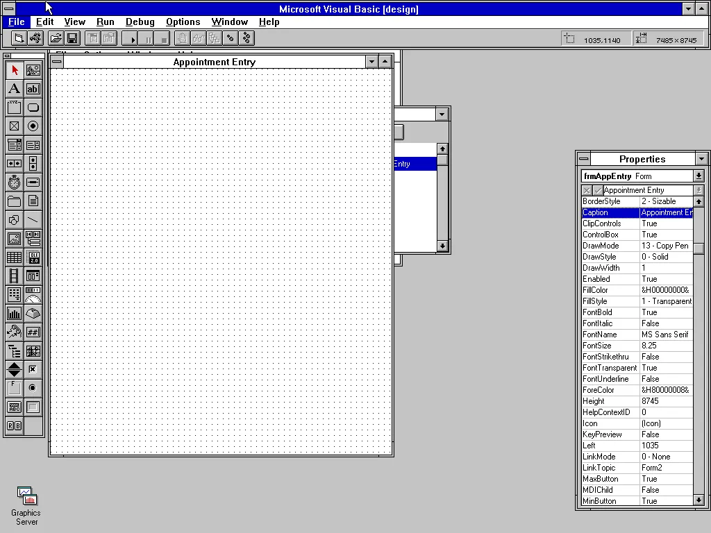
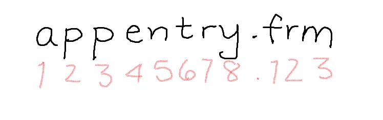
I’m confident that one of the earliest forms I authored was the appointment entry form. Why? Because of what I didn’t know at the time. Apparently, the accepted abbreviation for appointment is appt. I did not know that. When creating a user interface in Visual Basic 3, the developer would create what is called a “Form” file, ending with the file extension frm.
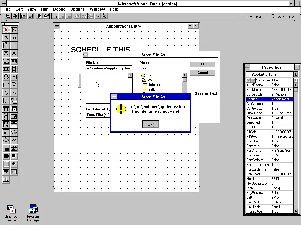
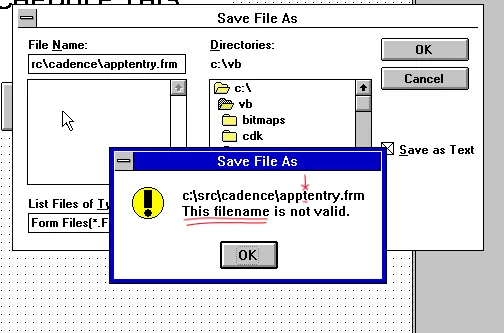
This wasn’t a huge deal by any means, but in my defense I may have chosen the file name before I settled on the VB name:
Let the record show, as you can see from the screen shot:
8.3 Character File name limitations
As Windows 3.11 (and earlier) were still running on Microsoft DOS, Windows inherited the limitations of the DOS file system. The limits were that a file name could be up to 8 characters long, and the file extension no more than 3.
Demonstration and more Deadlines
I know that we successfully demonstrated a few very basic workflows by the end of October and that success was immediately turned into a new Thanksgiving deadline. My more mature self sees these as pointless development marches with deadlines that reflected zero knowledge of how much time building the next set of features would take. The worst type of project management.
And yet, off we went for the next deadline.
I’ll talk more specifically in a later blog post about some of the Visual Basic issues in the those years that we encountered when doing development and eventually what we tried to do about it.
Unfortunately, my last “big” project on the Cohort Lab team was frustrating and demoralizing (read more). As I mentioned, I talked to my TL about wanting a change. At first, it was just minor grumbles and expressing some desire for a new bigger project. Coincidentally, and luckily, a friend from college had just entered into the job market and was already making significantly more than I was at Epic. Although it wasn’t work that I wanted to do at the time (he was working as a full-time consultant) it was very useful as leverage. My career change tactics became not so subtle hints and I made it clear that moving to the suburbs of Chicago where he was employed wouldn’t be a big deal for me, especially as my one year lease on my apartment was ending (and I’d already decided I wanted to find a new apartment that had an in-unit clothes washer and drier).
She took my request to Carl and promised to help me navigate options.
I didn’t throw down an ultimatum of “must be on a new team by September 1, 1994 or I’ll leave” … I trusted her to work on it with Carl and make a plan.
During this period a number of noteworthy things happened.
Epic bought a building!
The Medical Circle building was bursting at the seams. Offices were cramped, doubled (and tripled!) and parking was at a premium. The parking lot overflowed with cars and only early arrivals were able to park in the lot. To meet the demands of the growing staff numbers (around 50-60), a new place was desperately needed. Epic bought a former school at 5301 Tokay Boulevard in Madison and as soon as occupancy and networking were in place, several teams were moved into the building. It wasn’t ready for general occupancy, and a lot of construction was needed. Cubicles were arranged in open areas and some offices were available. I initially shared an office. More accurately, it hadn’t been an office: it was the size of a small cafeteria. I don’t remember if we knew what the original purpose of this large space was or how it had been used, but it was about 60ft x 30ft (9m x 18m). It was ridiculous with a large sloped ceiling and one set of windows in an alcove area. While it would have been amusing to try to set up in the middle of this room, cabling and electrical weren’t available. Instead, we setup as far away as possible.
Hi hi! Fire Marshall! Look at how many extension cords and power strips we needed to make this desk arrangement work!
I’m know there are software startups with a dozen employees that have been crammed into rooms smaller than this was (I’ve interviewed at a few). The wall arrangement wasn’t permanent as the room was eventually converted into other more practical space.
I wish I remembered the specifics of the technology used for making the phone and networking connections between the two Epic buildings. There weren’t many options back then and it was either an expensive leased line or a carefully pointed wireless system (designed for point to point wireless). I know Epic had wireless systems installed at the Tokay buildings but I don’t remember the timeline. Either way, the connections weren’t always reliable. Think better than Satellite TV service. As most development happened direct to a server over a terminal or locally on a PC, it didn’t need to be blazing fast (blazing 9600 baud?).
Working Remotely
Not too surprisingly, having two buildings that were practically speaking too far apart to walk (about 0.9 miles one way) was fine. There was an occasional glitch where all connectivity was lost to the main building (phones and network) but it wasn’t too frequent that it became a big issue. Collectively, we still were able to work together even though we weren’t in the same general location.
I got a PC!
The Cohort Lab team members were last to get PCs because the team generally had the least need for them. But, there was a general push to get Microsoft Office applications available and that meant rolling out Windows 3.11 for Workgroups to the masses. PowerPoint! For UGM that year there was a drive to have all presentations use PowerPoint. Star Wipes 4 Ever! (the glorious star wipe may not have been a feature yet though unfortunately)
As I had the most experience with a PC and had the most interest, I was the recipient. Honestly, in the era before we had Internet access, having a Windows PC for the type of terminal-based development I’d been doing on Cohort lab wasn’t needed, but it was a welcome upgrade. Epic bought a lot of Gateway computers eventually, but I don’t know if the first one I received was a Gateway (Gateway: Holstein cows like branding.) It’s dissapointing that the Wikipedia article doesn’t show any of the shipping boxes.
A new TEAM!
Epic’s Legacy product (the EHR/EMR), AKA EpicCare, AKA EpicCare Ambulatory, wouldn’t be the only graphical application sold by Epic. Rather than starting from scratch as had been done with Legacy, the decision was made to create a graphical interface for Cadence, Epic’s ambulatory (patient) scheduling product. I wasn’t privy to the selection nor did I consider it much at the time. Looking back at that now, I would have argued that concentrating more on the user experience for the terminal-based Cadence would have provided tangible lower-cost wins allowing resources to be devoted to building up a larger portfolio of products earlier.
But, that’s not what happened.
A new Cohort Team Member
Once the team transfer had been decided, Cohort Lab needed to find a replacement. It wasn’t long before I was mentoring the new employee that was joining Cohort. My first mentee!
Transfer Scheduled
My first day on the Cadence GUI team was scheduled near the end of September 1994. We’d be using Visual Basic 3.0, released earlier in 1994. My first month on Cadence is the topic for next time.